| Pages: 1 2 3 |
Pirk
Posting Freak

Posts: 3976
Registered: 3-11-2003
Location: France
Member Is Offline
|
 posted on 2-24-2008 at 05:23 PM posted on 2-24-2008 at 05:23 PM
|


|
|
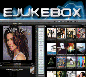
CrimsonLive 3 Skin [Development]
Hi everyone!
These last days I've made a few more work on my CrimsonLive skin. Improved the search area, and finally this week-end also made a new Artist list!
 So I think a new version of my CrimsonLive skin should come soon.. So I think a new version of my CrimsonLive skin should come soon..
Here is how it looks at the present time:
PS: The mask in the artist list is animated! 
 Pirk |
|
|
Audiosoft
|
|
posted on 2-24-2008 at 10:08 PM
|
|
|
Looks great Pirk! Looking forward to CrimsonLive 3!
I wonder what do the songs in the playlist look like? I was hoping maybe you would go back to the old darker style or a new one.
Audiosoft |
|
|
Pirk
Posting Freak
Posts: 3976
Registered: 3-11-2003
Location: France
Member Is Offline
|
|
posted on 2-25-2008 at 12:48 PM
|
|
|
Thank you Audiosoft.
I've not changed the playlist, but if you prefer a dark version I will see what I can do..  I think I will try to put the Vista dark bar there too! I think I will try to put the Vista dark bar there too!
Pirk |
|
|
Pirk
Posting Freak
Posts: 3976
Registered: 3-11-2003
Location: France
Member Is Offline
|
|
posted on 2-25-2008 at 07:56 PM
|
|
|
So now.. the Playlist!
Do you like this style, guys?
Ok, the "EJ Star" logo is not new.. but just tell me if you can accept it or if you think I should try something else?
Thanks.
Pirk |
|
|
Pirk
Posting Freak
Posts: 3976
Registered: 3-11-2003
Location: France
Member Is Offline
|
|
posted on 2-25-2008 at 08:25 PM
|
|
|
Removed the useless background behind the "Next" area..
Pirk |
|
|
Audiosoft
|
|
posted on 2-25-2008 at 08:39 PM
|
|
|
Thanks Pirk...The dark tracks look better but I think I prefer them with the 'up next' background and playlist background in your first pic.
Audiosoft |
|
|
Pirk
Posting Freak
Posts: 3976
Registered: 3-11-2003
Location: France
Member Is Offline
|
|
posted on 2-25-2008 at 08:47 PM
|
|
|
So you prefer this version?
Pirk |
|
|
Audiosoft
|
|
posted on 2-25-2008 at 09:13 PM
|
|
|
ah i guess it does looks better with EJ star for that screen resolution
Audiosoft |
|
|
Pirk
Posting Freak
Posts: 3976
Registered: 3-11-2003
Location: France
Member Is Offline
|
|
posted on 2-25-2008 at 10:07 PM
|
|
|
well, I'm not sure I understood what you mean, but here is another version!
Pirk |
|
|
Pirk
Posting Freak
Posts: 3976
Registered: 3-11-2003
Location: France
Member Is Offline
|
|
posted on 2-25-2008 at 10:42 PM
|
|
|
New transparent "Next" bar:
Pirk |
|
|
Audiosoft
|
|
posted on 2-25-2008 at 10:57 PM
|
|
|

Audiosoft |
|
|
Pirk
Posting Freak
Posts: 3976
Registered: 3-11-2003
Location: France
Member Is Offline
|
|
posted on 2-25-2008 at 11:04 PM
|
|
|
Transparent links..
Pirk |
|
|
Pirk
Posting Freak
Posts: 3976
Registered: 3-11-2003
Location: France
Member Is Offline
|
|
posted on 2-25-2008 at 11:13 PM
|
|
|
The whole thing..
Pirk |
|
|
Pirk
Posting Freak
Posts: 3976
Registered: 3-11-2003
Location: France
Member Is Offline
|
|
posted on 2-27-2008 at 11:05 PM
|
|
|
Transparency
Added more transparency effects in the playlist.. and finally even the golden Star seems to generate its own beam of light!!
Pirk |
|
|
Pirk
Posting Freak
Posts: 3976
Registered: 3-11-2003
Location: France
Member Is Offline
|
|
posted on 2-28-2008 at 11:35 PM
|
|
|
Tonight work..
I've added a new effect on the artist names in the songlist:
Pirk |
|
|
crlove
Member
Posts: 219
Registered: 11-13-2005
Member Is Offline
|
|
posted on 3-1-2008 at 02:52 AM
|
|
|
My suggestions
| Quote: | Originally posted by Pirk
Do you like this style, guys?
Ok, the "EJ Star" logo is not new.. but just tell me if you can accept it or if you think I should try something else?
|
I don't like the EJ or Star in the play list I think it makes it hard to read some of the song info. I think the new rounded look in the artist list
and play list look great. The mask looking face in the artist list is a bit strange and I could do without it. The round look could carry over easily
into the list of songs when you choose an artist. As always I still think the overall skin is great. Crimson live 2.1 is my default screen now and
I'm sure 3.0 will be my future default screen.
Keep up the good work.
|
|
|
Pirk
Posting Freak
Posts: 3976
Registered: 3-11-2003
Location: France
Member Is Offline
|
|
posted on 3-1-2008 at 09:16 PM
|
|
|
Flying bird..
OK guys.. I replaced the CD Star by a Flying Bird!!
I just hope you'll like it more?
Thanks.
NB: The bird really fly over the playlist!
Pirk |
|
|
Pirk
Posting Freak
Posts: 3976
Registered: 3-11-2003
Location: France
Member Is Offline
|
|
posted on 3-1-2008 at 09:31 PM
|
|
|
...
Pirk |
|
|
Pirk
Posting Freak
Posts: 3976
Registered: 3-11-2003
Location: France
Member Is Offline
|
|
posted on 3-1-2008 at 09:45 PM
|
|
|
This time I think the Up Next song text is still readable, even when the song title encroach on the bird.
Pirk |
|
|
Pirk
Posting Freak
Posts: 3976
Registered: 3-11-2003
Location: France
Member Is Offline
|
|
posted on 3-1-2008 at 11:50 PM
|
|
|
Readded the CD Star, but this time more discreetly..
Would you like I remove the bat?
Pirk |
|
|
Pirk
Posting Freak
Posts: 3976
Registered: 3-11-2003
Location: France
Member Is Offline
|
|
posted on 3-2-2008 at 12:55 AM
|
|
|
My bat can also fly at the bottom! 
Pirk |
|
|
Pirk
Posting Freak
Posts: 3976
Registered: 3-11-2003
Location: France
Member Is Offline
|
|
posted on 3-2-2008 at 01:03 AM
|
|
|
...
Pirk |
|
|
Pirk
Posting Freak
Posts: 3976
Registered: 3-11-2003
Location: France
Member Is Offline
|
|
posted on 3-2-2008 at 01:21 AM
|
|
|
... I hope you like??
Pirk |
|
|
crlove
Member
Posts: 219
Registered: 11-13-2005
Member Is Offline
|
|
posted on 3-3-2008 at 01:19 AM
|
|
|
|
I think the bird or star takes away from the up next/playlist area I think simpilier is better. I do like the framing of the album and the layout of
the up next area in your last attachment. I'd just remove the bird from the playlist area. Do you think you will be able to use your rounded look in
the song pick list? I think it would really look really great.
|
|
|
Pirk
Posting Freak
Posts: 3976
Registered: 3-11-2003
Location: France
Member Is Offline
|
|
posted on 3-3-2008 at 10:11 AM
|
|
|
crlove,
Thanks a lot for giving your opinion. Well, I think I will end to remove the bird.. I have some others "nice" animated gifs, but I fear they will
also take away from the up next area. It's a shame because the on move transparency effect underneath the song name is very interesting.
The playlist rounded look in the songlist? I will try how it looks. I suppose you wish a dark songlist?
Pirk |
|
|
crlove
Member
Posts: 219
Registered: 11-13-2005
Member Is Offline
|
|
posted on 3-4-2008 at 01:45 AM
|
|
|
| Quote: | Originally posted by Pirk
The playlist rounded look in the songlist? I will try how it looks. I suppose you wish a dark songlist? |
I'll leave that up to you I'm not sure how the dark would look. You seem to be very good at figuring out the color layouts so I'll just go with
your opinion. I can't wait till you release the new version it's going to look great.
|
|
|
Pirk
Posting Freak
Posts: 3976
Registered: 3-11-2003
Location: France
Member Is Offline
|
|
posted on 3-4-2008 at 10:37 AM
|
|
|
Audiosoft,
How could I center the background of the numbers in the playlist without damage it in the up next area?
If I put "background-position: right center;" in a: link {} then the up next area looks bad when there are several lines. So I put
"background-position: right top;" and the up next area looks good, but then there is a gap in the playlist numbers.. I hope you understand what I
mean!
Thanks.
Pirk |
|
|
Pirk
Posting Freak
Posts: 3976
Registered: 3-11-2003
Location: France
Member Is Offline
|
|
posted on 3-4-2008 at 11:50 PM
|
|
|
| Quote: | Message original : Pirk
Audiosoft,
How could I center the background of the numbers in the playlist without damage it in the up next area?
If I put "background-position: right center;" in a: link {} then the up next area looks bad when there are several lines. So I put
"background-position: right top;" and the up next area looks good, but then there is a gap in the playlist numbers.. I hope you understand what I
mean!
Thanks. |
Audiosoft,
There is no solution??
Pirk |
|
|
Pirk
Posting Freak
Posts: 3976
Registered: 3-11-2003
Location: France
Member Is Offline
|
|
posted on 3-5-2008 at 12:07 AM
|
|
|
crlove,
Any chance you like this animated gif? You can imagine it suggests live tapes..
Pirk |
|
|
crlove
Member
Posts: 219
Registered: 11-13-2005
Member Is Offline
|
|
posted on 3-5-2008 at 01:04 AM
|
|
|
| Quote: | Originally posted by Pirk
crlove,
Any chance you like this animated gif? You can imagine it suggests live tapes.. |
That would look good for a video file
|
|
|
| Pages: 1 2 3 |