Audiosoft
|
|
posted on 8-23-2004 at 08:57 AM
|


|
|
Left Panel Resizing coming to v4.0
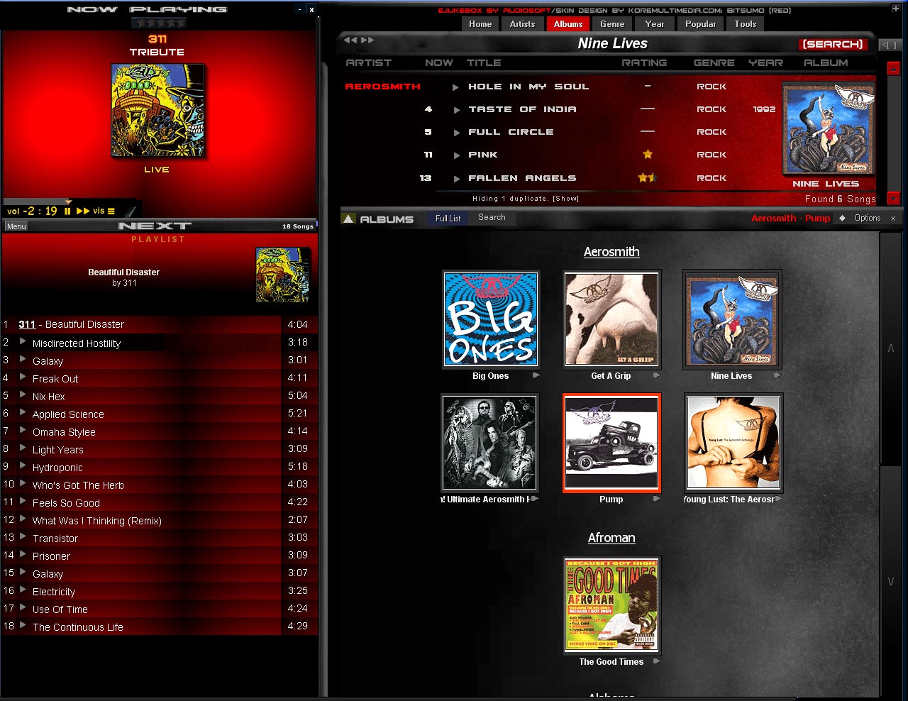
Here is a sneak peak of the Left Panel Resizing ability that EJUKEBOX v4.0 will have. To resize the left panel you just grab the middle divider and
drag. Once the left panel width exceeds 400 or so pixels it adds the playtime next to each track in the playlist.
This screenshot shows a beta version of eJukebox in development maximized under 1280x1024. The left panel's width is increased so that eJukebox
call fill the entire screen width.
v4.0 will have a new maximize button (not in this screenshot) which will automatically size the left panel and ejukebox's height so they fill the
screen.
We are still working out some issues with this new feature....and are considering re-doing eJukebox's play controls in FLASH, HTML, Winamp5 skin
overlay or some other way which will allow better skinning ability and horizontal resizing for v4.0.
Audiosoft has attached this image:

 Audiosoft |
|
|
junk
Member
  
Posts: 480
Registered: 5-10-2003
Location: Norway
Member Is Offline
|
|
posted on 8-23-2004 at 09:10 AM
|


|
|
|
Ah, lovely! Looking forward to this... will i be able to resize it all over my three monitors, 3072x768? Would be interesting to have an albumlist
that could fill up the space. Or even better, to have the possibility to show both the albumlist and the songlist next to each other... i'd like
that very much, i think.
|
|
|
Fishy
Senior Member
   
Posts: 960
Registered: 10-19-2003
Location: Norway, Trondheim
Member Is Offline
|
|
posted on 8-23-2004 at 10:45 AM
|


|
|
This looks absolutely brilliant! Allowing larger coverimages, playcontrols and more information in the playlist/Now playing panels in general...
Starting to look forward to 4.0 already. Also noted those new arrows in the albumlist scrollbar.. Autoscroll areas, right?
Keep up the good work 
-----------
Fishy
|
|
|
Pirk
Posting Freak
    
Posts: 3976
Registered: 3-11-2003
Location: France
Member Is Offline
|
|
posted on 8-23-2004 at 12:23 PM
|


|
|
Great news today! 
I feel that eJukebox 4.0 will look perfect on my new 1280x1024 LCD screen! 
I hope that the new left panel resizing ability will allow to display larger album images?
The best would be the image size is increased (by direct "on fly" resizing) according to the new left panel wide chosen by the user. That
would be a cool feature!
|
|
|
jojo
Member
  
Posts: 101
Registered: 9-25-2003
Location: Florence, Oregon
Member Is Offline
|
|
posted on 8-23-2004 at 04:21 PM
|


|
|
WOW! 4.0 is really looking nice, Audiosoft... Now I can't wait even more. I'm hoping some exporting of ratings is coming too, Looks like
some major enhancements are in store for us in a very near future.
I'm anxiously awaiting for the "update" message to come up on my screen.
|
|
|
jhlurie
Member
  
Posts: 212
Registered: 3-11-2003
Member Is Offline
|
|
posted on 8-23-2004 at 06:56 PM
|


|
|
Resize
Any chance for the entire thing to be resizable? One of the less pleasant restrictions of eJ is the fact that you are kind of stuck with
"set" sizes--at least along the left/right sides.
Or is the idea that the left side resizing will make up for the lack on the right side--that you can make it larger to fill any gap?
|
|
|
stsirois
Member
  
Posts: 156
Registered: 3-11-2003
Location: Rochester, NH USA
Member Is Offline
|
|
posted on 8-24-2004 at 11:53 PM
|


|
|
| Quote: | Originally posted by Audiosoft
...We are still working out some issues with this new feature....and are considering re-doing eJukebox's play controls in FLASH, HTML, Winamp5
skin overlay or some other way which will allow better skinning ability and horizontal resizing for v4.0. |
How about XML? It seems all the rage with HTPC skinnable programs like GotAllMedia, Meedio, etc.
Thanks,
Steve
|
|
|
Kimper
Junior Member
 
Posts: 9
Registered: 7-18-2004
Member Is Offline
|
|
posted on 8-30-2004 at 02:31 AM
|


|
|
That's going to be awesome on the HDTV!
Based on that I went ahead and bought the full version of Ejukebox this evening!
Now please don't forget to add support for some form of lossless codec 
B&W speakers just beg for the best quality you can feed them!
Great work guys!
Once 4.0 is out I will plug it on avsforum.com, and maybe we can talk htpcnews.com into reviewing it?
Thanks!
Kimper
|
|
|
slick
Junior Member
 
Posts: 54
Registered: 6-23-2004
Member Is Offline
|
|
posted on 9-1-2004 at 10:57 PM
|


|
|
I applaud the decision to make ej full screen. I see the responses have been very postive.
However, from the shot you've given, you are not offering anything more than we have already. Can this additional space be used for something?
How about showing a column to the right of the playlist showing the info from the home page i.e most played?
Just a thought. I'm sure v4 will be successful, whatever the outcome!
|
|
|
Audiosoft
|
|
posted on 9-1-2004 at 11:16 PM
|


|
|
slick,
That's a good possibility or we may even allow grouping of songs in the playlist by album cover image, to fill the extra space.
Call for Help
If anyone is interested in helping design a new 'now playing' panel layout or new play controls (double the height of 3.x's but still
needs to fit in the standard width and also be resizable in HTML) or a new look/layout/buttons for the top of the right panel...feel free to give it a
shot in photoshop and post. In v4.0, we are going to have both the play controls and the top right panel will be done in HTML with the possibility for
java applets and flash interfaces. So if you want to design in HTML or Flash that is even better. If we get some help on this we should be able to
speed up the release of v4.0.
 Audiosoft |
|
|
Willum
Member
  
Posts: 117
Registered: 5-29-2004
Location: Amsterdam
Member Is Offline
|
|
posted on 9-2-2004 at 05:24 AM
|


|
|
Audiosoft,
I still would like to have a resisible banner on the screen (show/don't) with adjustible fontsize. At the moment i still use the 'Desktop
Caption Plug-in', but i should like it to see integrated into V4.
|
|
|
slick
Junior Member
 
Posts: 54
Registered: 6-23-2004
Member Is Offline
|
|
posted on 9-6-2004 at 05:44 PM
|


|
|
Just thrown a massive party in a house in the country. Used eJ running through a huge pa system with the monitor & mouse right next to the
dancefloor. It went down a storm! It made finding songs sooo much easier. However, the 5k songs I have in the jukebox are not enough. I need to rip
the rest of my collection soon.
So far, about 6 of my friends have bought the program with another 3 talking about it.
I think I'll design an interface and fire it your way. I'll start in photoshop and maybe end up in flash.... If it doesn't workout, it
may get some ideas going.
|
|
|
slick
Junior Member
 
Posts: 54
Registered: 6-23-2004
Member Is Offline
|
|
posted on 9-21-2004 at 05:19 PM
|


|
|
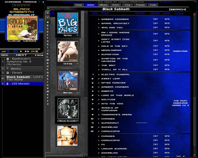
Here is a rough mockup of how I reckon v4 should look like.
The middle section could swap between artist list and albums. Wider than usual, it allows long names to be displayed on the same line without
wrapping.
e.g
ozzy osbourne
not
ozzy
osbourne
The right hand section could stay wide, always showing year, genre etc.
The left hand section just a little wider.
What do you think?
slick has attached this image:

|
|
|
Fishy
Senior Member
   
Posts: 960
Registered: 10-19-2003
Location: Norway, Trondheim
Member Is Offline
|
|
posted on 9-21-2004 at 07:59 PM
|


|
|
Interesting.. but I don't know if I like the idea of contracting the albumlist so much that it is just possible to show one album horizontally..
I think it should at least be 4 at a row, as it is currently.. Or maybe even 6 if it was possible to resize it properly.. Possible some crash of
philosophies. From my point of view the albumlist operates as the heart of ej, but for users that tend to use the songlist area a lot while browsing
albums and songs this kind of setup could be a very good one..
However I can't advocate it while being such a hardcore fan of a large and heavy albumlist 
-----------
Fishy
|
|
|
Pirk
Posting Freak
    
Posts: 3976
Registered: 3-11-2003
Location: France
Member Is Offline
|
|
posted on 9-21-2004 at 11:02 PM
|


|
|
Like Fishy, i also prefer the current album list...
Thank you for your work on eJukebox, slick!
|
|
|
timmyotoole
Junior Member
 
Posts: 56
Registered: 4-11-2003
Member Is Offline
|
|
posted on 9-22-2004 at 01:24 AM
|


|
|
i really like the idea of being able yo browse the albums vertically in one row as slick as shown above. i think it would be great to be able to do
this while having the soglist open.
great design good work
If Nothing We Do Matters...
Then All That Matters Is What We Do
|
|
|
junk
Member
  
Posts: 480
Registered: 5-10-2003
Location: Norway
Member Is Offline
|
|
posted on 9-22-2004 at 10:46 PM
|


|
|
As long as this is in addition to the original vertical design, let us be able to switch between vertical and horizontal.
I know that many people, in this forum, me, Fishy, and Pirk, still feel that the album list is much of the "heart" of eJukebox, to use such
a cliché terminology. So as long as there is a switch between horizontal and vertical layout, I will not mind at all.
|
|
|
slick
Junior Member
 
Posts: 54
Registered: 6-23-2004
Member Is Offline
|
|
posted on 9-23-2004 at 08:18 AM
|


|
|
Thanks for the feedback guys.
The vertical list wasn't meant to replace the current album list, just allow you to view them differently. Instead of having row after row of
albums (I never view my collection that way) show albums alphabetically. That way, if you select "s", you see a column of slayer, slipknot,
sepultura.
|
|
|
Fishy
Senior Member
   
Posts: 960
Registered: 10-19-2003
Location: Norway, Trondheim
Member Is Offline
|
|
posted on 9-23-2004 at 07:49 PM
|


|
|
Different views to choose from is always a good idea  As long as not a
specific view is forced upon the user.. Make things optional and people will shut up As long as not a
specific view is forced upon the user.. Make things optional and people will shut up 
-----------
Fishy
|
|
|


