Audiosoft
|
|
posted on 4-16-2004 at 08:06 PM
|


|
|
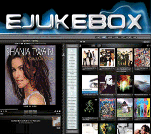
Proposed Changes to Artist List Alignment in Non EDV View
We are thinking about making the Artist List always line up at the top like in this screenshot for the next version. This would change it from the way
it was before which placed the artist list lower so you could see a little bit of the songlist artist colum. Let us know your thoughts on this and if
there are any objections. Thanks.
Also, if we do implement this, we will make it so XYZ# are always visible on the jump bar (without needing to mouse over W)...since they will be able
to be seen on 800x600 with the artist list being higher up.
Audiosoft has attached this image:

 Audiosoft |
|
|
Pirk
Posting Freak

Posts: 3976
Registered: 3-11-2003
Location: France
Member Is Offline
|
|
posted on 4-16-2004 at 09:02 PM
|
|
|
I think it's rather a good idea, you are right: why to keep this tiny loophole toward the artist column? it is so small... you may as well remove
it!
So, no "objection" for my part! 
|
|
|
Audiosoft
|
|
posted on 4-17-2004 at 04:35 AM
|
|
|
Well here is an actual screenshot of eJukebox w/ the artist list higher up and not - for comparision. The previous screenshot was a mockup - this one
is undoctored (except to combine the 2 images).
The XYZ# buttons have been added and will stay no matter what we decide for the artist list position.
We also changed the artistlist width to align with the songlist shadow.
Audiosoft has attached this image:

Audiosoft |
|
|
Pirk
Posting Freak
Posts: 3976
Registered: 3-11-2003
Location: France
Member Is Offline
|
|
posted on 4-17-2004 at 10:32 AM
|
|
|
Ah... well, what bother me a bit on the first screenshot is the showarrow remaining... So now i don't know...
Maybe you could make the artist list be automatically reduced after use, and appear again when you mouse over its border  (like the windows task bar). In this way we will have both! the artist list
and the artist column... (like the windows task bar). In this way we will have both! the artist list
and the artist column... 
|
|
|
junk
Member
Posts: 480
Registered: 5-10-2003
Location: Norway
Member Is Offline
|
|
posted on 4-17-2004 at 11:56 AM
|
|
|
You are definately on to something, as the one artist line can be both pointless and look a bit strange as well (especially if you scroll down the
songlist). Go for it!
The only thing i didn't like was that the was the narrowing of the Artist List... i see that on your screenshot George Harrison takes up two
lies, whereas he only needs one line in the current eJ. I think we need the current lenght of the Artist List to avoid the artist names getting
unneccecarily broken up.
|
|
|
Demnos
Member
Posts: 207
Registered: 3-11-2003
Location: Berlin, Germany
Member Is Offline
|
|
posted on 4-19-2004 at 09:15 AM
|
|
|
First of all: great idea to finally have XYZ... on the menu.
Second: I see a problem with the new layout: Now you are mixing the column headers of two different menus on the top line, i.e. you see "Artist
List" from the Artist List, and next to it "Play Now", "Song Title" etc. from the songlist. But they look the same in style
an color. To me, this is somewhat of a "No-No" from a human-interface-design point of view, you really shouldn't be mixing these. Or at
the very least, change the color of "Artist List".
And finally...I still don't see any star rating on the song list (ok, just kidding, I know you are working on it...)
|
|
|